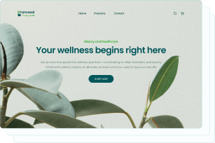
View
Drag


Let’s talk about your website. It’s your digital storefront, your online handshake. But here’s the thing: not all web design trends are your friend. Some are like that one coworker who means well but always ends up making things more complicated. Others are just straight-up bad ideas that should’ve been left in the early 2000s, right next to frosted tips and low-rise jeans.
As a small business owner, you’ve got enough on your plate without worrying whether your website is secretly driving people away. So, let’s break down the web design trends you should avoid - and why. We’ll even throw in some tips to keep your site looking sharp, functional and most importantly, effective.
And hey, if you’re in Michigan and need help with search engine optimization, web design or web development, we’re here to help. At Hierographx, we’ve seen it all- the good, the bad and the downright ugly- and we’re here to help you avoid the pitfalls.
You know that feeling when you’re trying to find something in a cluttered drawer, and after five minutes of digging, you give up and just buy a new one? That’s what overly complex navigation feels like for your website visitors. If they can’t find what they’re looking for quickly, they’ll leave your site and 'buy a new one' by going to a competitor instead.
When your website navigation is overly complex, with too many options or categories, users can feel overwhelmed and frustrated. If they can’t easily find what they’re looking for, they’re likely to leave your site and look for a simpler, more user-friendly alternative. They don’t know where to click, they get frustrated and they leave. And let’s not even get started on how much search engines hate this. Google likes clean, logical structures.
Keep it simple. Think of your navigation like a roadmap- it should be easy to follow and get people where they need to go. Stick to 5-7 main menu items, use clear labels (e.g., “Shop,” “Services,” “Contact”), and if you’ve got a lot of content, consider adding a search bar. And whatever you do, please don’t hide your contact page. In the user testing we’ve done, one of the most common frustrations is when key actions, like contacting your team, are buried under layers of menus. It’s a missed opportunity to connect. That’s why we recommend making it as easy as possible for users to reach out, ideally in just one click. Tools like a contact popup or a chatbot can help users get help quickly, without the hassle of digging through navigation. Simplifying this process not only improves the user experience but also boosts conversions.
You’re just trying to read an article or check out a product, and suddenly your speakers blast some cheesy elevator music or an overly enthusiastic voice shouting, “HEY, WELCOME TO OUR SITE!” Autoplaying videos or sounds on websites are annoying because they disrupt the user’s experience, often interrupting their focus or surprising them with unwanted noise.
It’s intrusive, it’s annoying and it’s a surefire way to make people hit the back button. Plus, it’s a nightmare for mobile users who might be on limited data or in a quiet place. And let’s not forget accessibility- auto-playing media can be a real issue for people with sensory sensitivities.
Let your visitors decide when they want to watch or listen. Use a clear play button and keep things muted by default. If you’re worried about engagement, try a subtle animation or a static image with a “Click to Play” label. Trust me, your users will appreciate the courtesy.
Pop-ups can be useful- like when they remind you about an abandoned cart or offer a discount code. But when every click triggers a new pop-up begging for your email address, it’s like being followed around a store by a salesperson who won’t take “no” for an answer.
Too many pop-ups interrupt the user experience, and Google hates that. In fact, they’ve been known to penalize sites with intrusive pop-ups, especially on mobile.
Use pop-ups strategically. For example, an exit-intent pop-up that appears when someone’s about to leave your site can be a game-changer. Exit intent pop-ups are messages that appear on your screen when you’re about to leave a website. They’re designed to catch your attention at the last moment, often offering something helpful or special, like a discount, a free guide or a reminder, to encourage you to stay or come back later.
Think of it like a friendly wave from a shopkeeper as you’re walking out the door, saying, “Wait, don’t go yet!” Make sure they’re easy to close- no one likes hunting for the tiny “X” in the corner. We also recommend making pop-ups easy to close by allowing users to click anywhere outside the pop-up to dismiss it. Placing pop-ups in the center of the screen can feel intrusive and disruptive, so in many cases, positioning them in a corner works better. This way, they still grab attention without completely interrupting what the user is doing. Pro tip: A/B test your pop-ups to find the right timing and messaging.
If you’re struggling to strike the right balance, web development companies in Michigan like Hierographx can help you design pop-ups that actually work.
Imagine trying to fill out a contact form on your phone, but the dropdown menu is so tiny you can barely tap it, or the wrong keyboard pops up when you try to type. Frustrating, right? Even if a site is technically mobile-responsive, it doesn’t always mean it’s a good user experience. Mobile UX is far harder to perfect and small oversights, like poorly optimized forms, buttons that are too close together or text that’s hard to read, can drive users away.
Over half of all web traffic comes from mobile devices, so if your site isn’t optimized for phones and tablets, you’re essentially turning away the majority of your audience. Plus, Google uses mobile-first indexing, meaning it prioritizes the mobile version of your site for search rankings. A clunky mobile experience doesn’t just frustrate users, it hurts your SEO, too.
Invest in a truly responsive design that adapts seamlessly to any screen size. Test your site rigorously on different devices, paying special attention to interactive elements like forms, dropdowns, and buttons. For example:
Ensure dropdown menus trigger the phone’s native scroll selector for easy use.
Make buttons large enough to tap without zooming in.
Use the correct keyboard type for each field (e.g., number pads for phone fields).
Avoid placing pop-ups in the center of the screen, which can block content and feel intrusive.
Mobile UX deserves just as much attention, if not more, than the desktop version of your site. After all, a stunning desktop design won’t matter if most of your users are on their phones and can’t navigate your site easily.
If you need help, Hierographx specializes in creating responsive, mobile-friendly websites that look and work great on any device.
Animations can be cool, like a subtle hover effect or a smooth scroll transition. But if your site feels like a theme park ride that won’t stop, it’s a problem.
Too many animations can slow down your site, and nobody likes waiting for a page to load. They can also be distracting, pulling attention away from your content or calls to action. If a site has too many animations, it might look visually stunning and impressive at first glance, but no one can tell what the site is about. We were so distracted by the animations that we completely skipped over the text, and missed the message entirely. And for users with cognitive or vestibular issues, excessive motion can be downright disorienting.
In most cases, the most effective animations are the subtle ones, so understated that some users might not even notice them. We like to think of animations and interactions as "delighters." The site should still function perfectly without them, but they add an extra layer of polish and help guide users through the content. However, finding the right balance can be tricky, which is why we often recommend user testing to see how real people interact with the design.
For example, on our own site, we initially used a trendy horizontal scroll feature to showcase our services. After testing and reviewing analytics, we discovered it frustrated users. We saw an increase in "rage clicks" as people tried to skip through the section. The issue? The horizontal scroll "locked" users into viewing every single service, removing their ability to control their own experience. People didn’t like feeling forced, they wanted the freedom to explore at their own pace.
The key takeaway? Animations should make users feel in control, not trapped. Use them sparingly and with purpose. Think of them like seasoning, a little sprinkle can enhance the dish, but too much ruins it. Stick to subtle effects that enhance the experience, like a button that changes color when hovered over or a gentle fade-in as you scroll. When done right, animations can elevate your site without overshadowing its purpose.
Have you ever tried to read light gray text on a white background? It’s like squinting at a faded road sign in the middle of a foggy day. Your website’s color scheme and typography should make reading easy, not give your visitors a headache.
Low contrast and hard-to-read fonts aren’t just a usability nightmare, they also make your site feel outdated. Think about it: light gray text on a white background or overly decorative fonts were trendy years ago, but today they scream “2005.” Not only do these design choices strain the eyes and make your content inaccessible to users with visual impairments, but they also frustrate everyone else trying to read or navigate your site.
When your site looks like it belongs in a different era, it doesn’t inspire confidence in your brand. Modern design prioritizes clarity, accessibility and simplicity, so ditch the faded colors and hard-to-read fonts. Opt for high-contrast text (like black or dark gray on white) and clean, legible fonts that reflect a polished, professional look.
Choose high-contrast color combinations (black on white, dark blue on light gray, etc.) and stick to clean, easy-to-read fonts like Arial, Roboto, Open Sans, Lato, Helvetica, Georgia or Times New Roman. Look at things like letter spacing, line spacing and in most cases a sans-seif font is easier to read in a paragraph setting. Avoid fancy script fonts for body text- they might look pretty, but they’re a pain to read. Don’t forget about accessibility guidelines to ensure your site is inclusive for all users, such as using descriptive alt text for images, ensuring sufficient color contrast for readability, providing keyboard navigation support and including captions for multimedia content.
Your website should guide visitors toward a specific direction- whether it’s buying a product, signing up for a newsletter or contacting you. But if your calls-to-action (CTAs) are MIA or buried under a pile of distractions, you’re missing out on valuable opportunities.
Without clear CTAs, visitors might browse your site and leave without taking any action. It’s like inviting someone to a party but forgetting to tell them where it is.
Make your CTAs impossible to miss. Use action-oriented language (“Shop Now,” “Get Started,” “Join Us”) and make them visually stand out with bold colors or buttons. Place them strategically throughout your site, like at the end of blog posts or on your homepage banner.
Nobody has time to wait for a slow website to load. If your site takes more than a few seconds, visitors are going to bounce.
Slow load times hurt user experience, SEO and conversions. In fact, studies show that a one-second delay can reduce conversions by up to 7%. Ouch.
Make your images smaller so they load faster, make sure you use a good host. Not every hosting service is created equal and some do better than others for different frameworks. Do some research before you just commit to one and remove any extra code that slows things down. Regularly test your site’s speed with tools like Google PageSpeed Insights and fix any issues. Remember, speed isn’t just a luxury- it’s a necessity.
Your website is your digital handshake, your first impression and your 24/7 salesperson. By avoiding these outdated and annoying web design trends, you’ll create a site that’s not only visually appealing but also functional, user-friendly and effective at driving results.
So, take a good look at your site. Is it a well-oiled machine or a clunky relic of the past? If it’s the latter, it’s time for a refresh. Hierographx specializes in creating websites that are as functional as they are beautiful.
At Hierographx, we’ve helped countless small businesses elevate their online presence with custom web design, development and Michigan search engine optimization. Whether you’re starting from scratch or need a site overhaul, we’ve got the expertise to make your website work as hard as you do.
Now that you’ve got the insights, it’s time to put them into action, start applying what you’ve learned and see the results for yourself! Your website (and your customers) will thank you. And if you need a little backup, you know where to find us.
Captivate your audience and enhance brand perception with our custom website design services, creating an unforgettable digital experience.

Captivate your audience and enhance brand perception with our custom website design services, creating an unforgettable digital experience.


