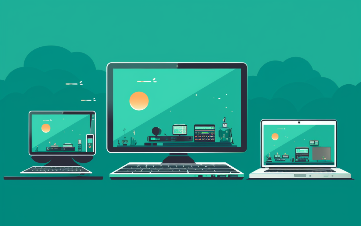


In the dawn of the internet age, aesthetics were often an afterthought. Early websites were simple and text-centric. Images, when they existed, were sparse and low-resolution. The aesthetics of web design were, in many ways, determined by the limitations of technology. Yet even in these rudimentary designs, the potential for artistry was evident.
The late 90s and early 2000s marked a renaissance in web aesthetics. With CSS, designers began experimenting with layouts, fonts and colors. Websites became more visually appealing, and the internet started its transformation into a visual medium. Flash took this to another level, allowing designers to incorporate animations and multimedia elements, fostering a more dynamic and immersive experience.

The rise of platforms like Facebook, YouTube and Twitter brought about a unique challenge and opportunity. These platforms not only shifted the content consumption patterns but also emphasized personal branding. Artists and designers found new avenues to express themselves, adapting to the constraints and possibilities of each platform, crafting unique visual identities that resonated with their audience.
Smartphones reshaped the canvas. Artists now had to think about how their works would appear on smaller screens. This era amplified the importance of minimalistic designs that prioritize content without compromising aesthetics. It was no longer about creating grand vistas but instead crafting intimate, captivating experiences.

As web capabilities grew, designers and artists got innovative tools. Parallax effects created an illusion of depth, offering viewers a more immersive and layered browsing experience. Single Page Applications (SPAs) became the galleries of the web, allowing users to traverse a variety of content without the disruptions of traditional page loads.
These design philosophies were more than just trends; they represented shifts in how we perceive and interact with digital content. Flat design stripped away embellishments, prioritizing simplicity and clarity, while Google's Material Design combined this simplicity with subtle gradients and animations, adding depth and dynamism to the user experience.

Open-source platforms enabled countless artists to showcase their work without needing extensive technical expertise. Themes and plugins on platforms like WordPress allowed artists to create digital galleries that reflect their unique style, further emphasizing the relationship between art and web aesthetics.

The importance of web accessibility in design can't be understated. As the digital art world expanded, designers and artists realized the importance of creating spaces accessible to everyone. An inclusive design ensures that everyone, irrespective of their abilities, can experience and appreciate the art on display.
Typography in web design isn't just about readability; it's about conveying a mood, a tone and a narrative. For artists, choosing the right font can set the atmosphere for their online gallery. Whether it's a bold, avant-garde typeface or a delicate, handwritten font, typography can be a powerful tool in an artist's digital toolkit.

Color is a language in itself. Understanding the nuances of color theory can help artists curate an online experience that complements their work. Warm colors might evoke feelings of passion and energy, while cooler tones can set a calming, reflective mood. By creating a cohesive color palette, artists can ensure their website becomes an extension of their art.
In art, the empty space around the subject can be as impactful as the subject itself. This principle holds true in web design as well. For artists, utilizing negative space in their website design can allow their work to stand out, free from distractions. It emphasizes the artwork and allows viewers to focus on the details without feeling overwhelmed.
The right animation can turn a static gallery into an interactive experience. Subtle transitions when artworks appear or a gentle parallax effect as one scrolls can make viewers feel immersed in an artist's world. However, the key is subtlety; overdoing animations can distract from the art itself.
Minimalistic design, emphasizing whitespace and clean lines, provides a clutter-free backdrop for art pieces, ensuring they remain the focal point. Meanwhile, features like dark mode are not just aesthetic choices but also enhance viewing comfort. AI tools are beginning to play a curator role, offering personalized art viewing experiences based on user preferences.

Augmented Reality (AR) is changing the way people view and purchase art online. Artists can offer viewers a tool to visualize how a piece would look in their own space, bridging the gap between the digital and physical realms. As AR tools become more accessible, they promise to revolutionize the way art is showcased and sold online.
The lines between the physical and digital art spaces are blurring. VR and AR promise immersive art experiences, transcending the limitations of traditional galleries. As these technologies become more mainstream, artists will have new dimensions and canvases to explore.

At Hierographx, aesthetics and functionality merge seamlessly. Our journey through the evolution of web aesthetics is a testament to the ever-changing, dynamic nature of the digital art space. As a leading web design company in Michigan, we're dedicated to helping artists craft the perfect online platform. Whether you're a seasoned artist or just starting, the digital realm offers limitless possibilities. Embrace it, and let your art shine!