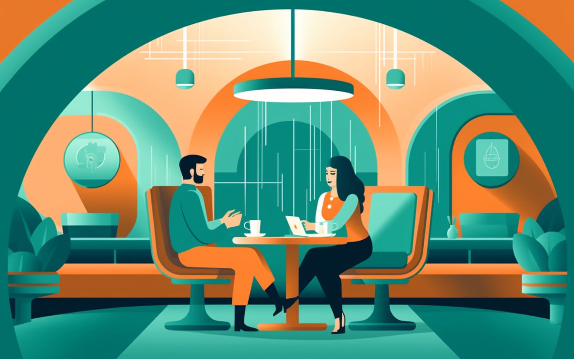


Retro design has always been about the celebration of a bygone era. It’s like a nostalgic walk down memory lane, and the feeling is intoxicating. You feel a rush of déjà vu as you're taken back to an era that many of us never even experienced firsthand. The excitement of reliving these moments is precisely what web designers try to replicate when they incorporate retro aesthetics into modern designs.
Remember when everything was simpler, a bit more colorful, and somehow more joyful? That’s exactly what retro design embodies and that’s why you can’t help but feel a wave of nostalgia when you encounter it. When a web designer brings this aesthetic to a website, it’s about more than just visuals. It’s about evoking feelings of warmth, comfort and familiarity.
But don't be fooled. Using retro design elements in modern web design isn't just about getting lost in a world of nostalgia. It's about blending the old with the new to create something strikingly memorable. A kind of perfect harmony where old meets new and they get along like old friends. By merging different elements, designers can create a website that is both distinctive and unforgettable.
Retro aesthetics bring a quirky touch to modern web designs. It's like adding a pinch of your grandma's secret spice to a modern recipe – it just makes everything taste better. Incorporating retro design into modern web aesthetics isn't about going full vintage, but rather using elements of the past to enhance the current design trends.
The biggest strength of retro-inspired design lies in its ability to connect with users on an emotional level. The use of old-school typography, classic color palettes and iconic design elements all play a part in striking that chord of nostalgia. These design components have a charm that can rarely be found in the sleek, minimalistic designs that are often seen today.
Retro design elements also have the power to make your website stand out in a sea of uniformity. In an era where minimalism and simplicity are king, a little bit of retro can make a big difference. It can give your website that unique flair, that spark of personality that instantly makes it more memorable.
At the core of every successful website is its ability to connect with its visitors. And this is where the marriage of retro and modern aesthetics shines. It brings together the familiar, warm feelings of nostalgia with the fresh, innovative spirit of modern design.
With the right blend of old and new, your website can evoke a powerful sense of connection with your audience. This connection goes beyond simple visuals – it evokes emotions, memories and experiences that are unique to each visitor. This deep, emotional connection can significantly increase user engagement, which is key to building a successful online presence.
But there's more to this blend than just evoking feelings. Incorporating retro aesthetics into your modern web design can also improve usability. Retro elements, such as bold typography and vibrant colors, can guide users' attention to important sections of your website. They also help to break up content, making it easier for your visitors to digest information and interact with your site.
Creating a successful blend of retro and modern aesthetics is both an art and a science. It requires a careful understanding of design principles, a sharp eye for detail and a deep appreciation for the past. It's about knowing which elements to include, where to place them, and how to make them work together seamlessly.
Retro-inspired websites aren't just visually appealing – they also offer a unique user experience. They break away from the 'norm' of modern web design and offer something different, something memorable. These sites are often the ones that visitors remember and return to, simply because they offer a different, more enjoyable online experience.
Creating this kind of experience requires a delicate balancing act. You want to include enough retro elements to evoke feelings of nostalgia, but not so many that your site looks outdated. You also need to ensure that your site is user-friendly and easy to navigate, despite its unique design.
At Hierographx, we understand the delicate balance that needs to be achieved when merging retro and modern aesthetics. We have a deep appreciation for the past and a keen eye for the future. As experienced web designers in Michigan, we are skilled at creating websites that offer a unique, enjoyable user experience.
We don't just create websites – we create online experiences. Experiences that resonate with your audience, that spark emotions and that create lasting impressions. Whether you want to incorporate retro typography, vintage color schemes or iconic design elements, we can make it happen.
So, are you ready to take your website to the next level? Are you ready to create an online experience that's both nostalgic and modern, familiar and innovative? If so, it's time to reach out to Hierographx. Let’s combine the warmth of retro design with the sleekness of modern aesthetics to create a website that's truly unique, truly memorable. Contact Hierographx today – let's create something remarkable together.