

Imagine going on a first date. You've picked out your outfit, rehearsed conversation starters and practiced your best smile. You're creating an impression, right? Now, let's shift that scene to your brand's digital presence. You're still looking to impress, but this time it's not just one person – it's your audience.
Designing a website is a lot like that. It's all about making a lasting impression. But how do you translate those brand ideals, personality and charm onto a webpage? That's where the magic of mood boards comes into play.
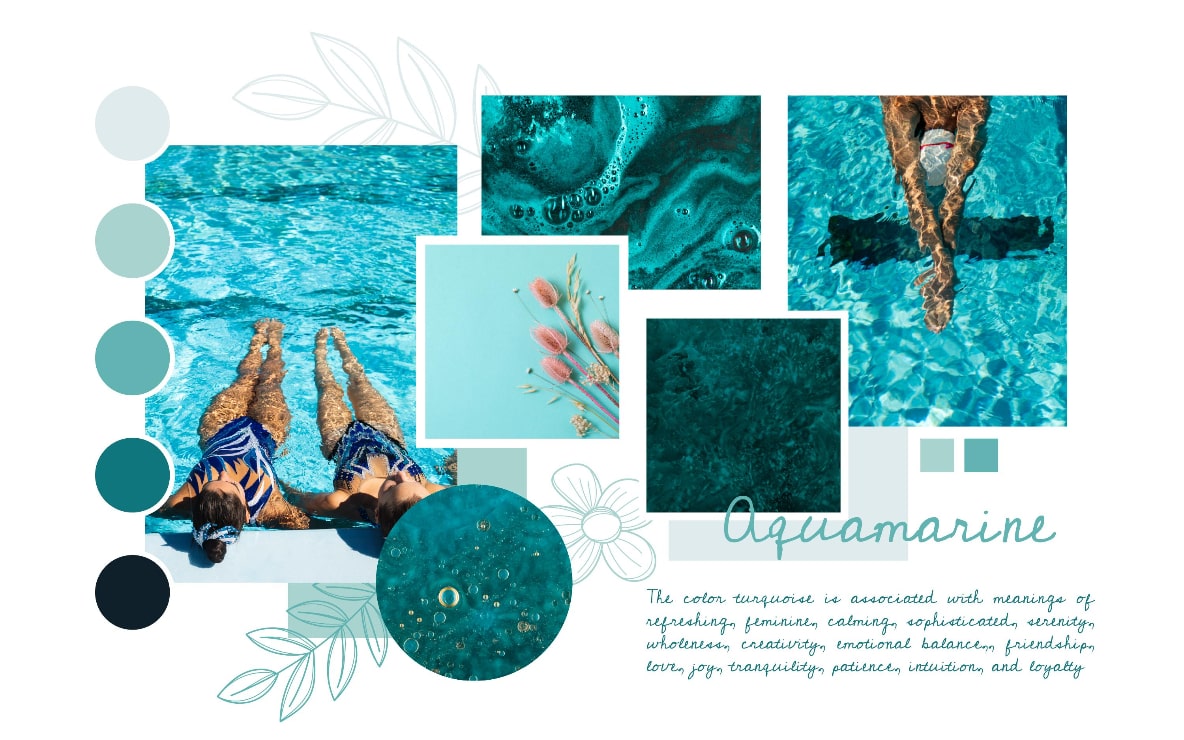
Let's dive deeper into the realm of mood boards. Picture a collage of images, colors, typography and textures that narrate a particular feeling, theme or style. That's a mood board for you. And it's more than just a digital scrapbook. It's a powerful tool that can make your brand's personality leap off the page and straight into the heart of your audience.
Creating a mood board is like laying the groundwork for your website's visual design. It helps you communicate your ideas, inspire creativity and facilitate collaboration. Think of it as a visual guide that keeps your design team and your brand objectives singing from the same songbook.
But, mood boards aren't one-size-fits-all. They can be digital or physical, minimalist or elaborate, color-centric or texture-driven. What matters most is that they effectively communicate your brand's vision and set the mood for your website design.
Think of your mood board as the superhero in your web design process. It doesn't just have one superpower, it has several. It's a communicator, an inspirer and a unifier. It takes your vision, wraps it in an enticing package and presents it in a way that everyone involved in the project can understand and align with.
The power of a mood board lies in its ability to visually translate your brand's personality. Instead of getting lost in translation between abstract ideas and concrete designs, a mood board bridges the gap. It gives a tangible shape to your brand's ethos and enables your web design team to visually navigate your brand's landscape.
Moreover, a mood board is an excellent tool for fostering collaboration. It enables your web design team to visually align with your brand's vision. It’s like a language everyone speaks, facilitating a smooth, creative dialogue that can help avoid misunderstandings and keep the design process humming along smoothly.
Creating a mood board is an adventure in itself. It's an opportunity to dive into the depths of your brand's identity, explore its uniqueness and bring its personality to life. The process usually begins by gathering inspiration. This can include images, color palettes, fonts, textures – anything that resonates with your brand's vision and values.
Next comes the curation process. This is where you narrow down your selections, keeping only those elements that truly embody your brand's essence. This process can be iterative; you might go through several rounds of selection and refinement until you arrive at a mood board that feels just right.
Finally, once your mood board is complete, it's time to share it with your design team. This is your chance to tell your brand's story, setting the stage for a website design that truly resonates with your audience.
Let's put theory into practice and take a look at how mood boards have played a pivotal role in successful website designs. From small startups to big corporations, businesses across the globe have used mood boards to guide their design processes and create memorable digital experiences.
An e-commerce brand, for instance, might use a mood board filled with vibrant colors, dynamic images and bold typography to convey a sense of energy and excitement. A nonprofit organization, on the other hand, might opt for a more muted color palette, coupled with powerful imagery and clean fonts, to evoke feelings of trust and compassion.
These real-world examples showcase the power and versatility of mood boards, underscoring their crucial role in the web design process.
If you've made it this far, you've taken the first step in understanding the key role mood boards play in the web design process. But don't worry, you're not in this alone. Our team at Hierographx, a leading web design firm in Michigan, is here to guide you through each step.
From selecting the right colors, fonts and imagery that personify your brand, to translating these elements into a functional and visually stunning website, we've got your back.
Mood boards are an integral part of our design process at Hierographx. We understand that each brand has its own unique personality, and we believe in crafting bespoke designs that align with your brand's vision. By incorporating mood boards into our process, we ensure that our designs resonate with your audience and tell your brand's story effectively.
In essence, mood boards are like the compass in your web design journey. They set the direction and the mood, guide the design process and ensure that the final design not only aligns with your brand's vision but also resonates with your audience.
So, are you ready to embark on your web design journey with Hierographx? Whether you're starting from scratch or looking to revamp your existing site, we're here to guide you every step of the way.
Remember, it all starts with setting the mood. Let's make your brand's first digital impression a lasting one. Connect with Hierographx today, and let's bring your brand's vision to life.