View
Drag


Website navigation doesn’t always get the credit it deserves. It’s not the flashy design or the eye-catching visuals that steal the spotlight, but without it, your website would be a total disaster. Think about it - how many times have you landed on a site, only to click around aimlessly because you couldn’t find what you were looking for? Frustrating, right? That’s exactly what bad navigation feels like for your visitors. And let’s be honest, nobody sticks around on a site that feels like a digital maze.
As a Michigan web design agency, we’ve seen it all - from navigation menus so intuitive they feel like magic to ones so confusing they belong in a puzzle game. That’s why we’re here to help you create a navigation system that’s not just functional but also intuitive and user-friendly. So, let’s break it all down and make sure your website navigation is on point.
Navigation is more than just a menu - it’s the backbone of your website. It’s what keeps users from getting lost, frustrated and ultimately leaving your site for greener (and less confusing) pastures. A well-designed navigation system does three key things.
First, it makes life easier for your visitors by helping them find what they’re looking for without breaking a sweat.
Second, it keeps them exploring by encouraging them to stick around and check out more of your content.
And third, it drives action by guiding users toward the pages that matter most, whether that’s your product page, contact form or blog.
In short, good navigation isn’t just a nice-to-have - it’s a must-have for any website that wants to deliver a great user experience. And if you’re not convinced yet, just think about the last time you got lost on a website. Not fun, right?
When it comes to navigation, less is more. A cluttered menu can overwhelm visitors and make it harder for them to find what they need. To keep things simple, limit your menu items to 5-7 top-level categories. If you have more, consider using dropdown menus or subcategories.
Focus on what matters most by prioritizing the pages that align with your business goals and user needs. For example, if you’re an e-commerce site, your “Shop” or “Products” page should be front and center. Remember, the goal is to make it as easy as possible for users to find what they’re looking for - not to showcase every single page on your site. And no, your 15-page FAQ section doesn’t need its own menu item.
Consistency is key to creating a seamless user experience. When your navigation is consistent across all pages, users know what to expect and can move around your site with confidence. Keep your menu in the same place (whether it’s at the top, side, or bottom of the page) and don’t move it around.
Use the same labels and styling throughout your site. If your “About Us” page is called “Our Story” on one page and “Who We Are” on another, you’re just creating confusion. Consistency isn’t just about aesthetics, it’s about creating a sense of familiarity that makes users feel comfortable and in control. And let’s be honest, nobody wants to play “Where’s Waldo?” with your navigation menu.
Your navigation labels should be straightforward and easy to understand. Avoid using jargon or overly creative terms that might confuse users. Instead, use simple, descriptive language like “Services,” “Products” or “Contact.”
Think like your users: what terms would they naturally search for? Use those. Clear labels not only improve usability but also help with SEO by making it easier for search engines to understand your content. And no, “Synergistic Solutions” is not a good label. Just say “Services” and call it a day.
The choice between vertical and horizontal navigation depends on your site’s structure and content. Horizontal navigation is the most common choice - it’s clean, familiar and works well for most sites. On the other hand, vertical navigation can be a good option for content-heavy sites with lots of categories. It keeps things organized without cluttering the page.
The key is to choose the format that best suits your site’s needs and user preferences. And no, you don’t get bonus points for being “unique” if it confuses your users.
With more than half of web traffic coming from mobile devices, responsive navigation is non-negotiable. Your site should look and function just as well on a smartphone as it does on a desktop. Use a hamburger menu for mobile - it’s a compact style that saves space and keeps things tidy on smaller screens.
Test your navigation on multiple devices to ensure it works seamlessly across all screen sizes. A mobile-friendly site isn’t just good for users - it’s also a ranking factor for search engines. And let’s face it, nobody’s going to pinch and zoom their way through your site in 2025.
Accessibility should be a priority in every aspect of web design, including navigation. Your site should be usable by everyone, including people with disabilities. Use high-contrast colors to ensure your menu is easy to read for users with visual impairments. Make clickable areas large enough to help users with mobility issues navigate your site more easily.
Ensure keyboard navigation works for users who rely on keyboards instead of a mouse. Accessibility isn’t just about compliance - it’s about creating an inclusive experience for all users. And if you’re not prioritizing accessibility, what are you even doing?
No matter how well you plan your navigation, the real test is how users interact with it. User testing can provide valuable insights into what’s working and what’s not. Observe real users as they navigate your site and identify any pain points. Ask for feedback—sometimes, the best way to improve is to simply ask users what they think.
User testing helps you see your site through the eyes of your audience, giving you the information you need to make improvements. And no, your mom’s opinion doesn’t count as user testing.
Analytics tools like Google Analytics can provide a wealth of information about how users interact with your navigation. Track popular pages to see if users are finding the pages you want them to. Identify drop-off points to understand where users are leaving your site. Analyze navigation paths to determine if users are following the paths you intended.
By analyzing this data, you can make informed decisions about how to optimize your navigation for better performance. And if you’re not using analytics, you’re basically flying blind.
Creating an effective website navigation isn’t a one-time task - it’s an ongoing process of testing, refining and improving. But when you get it right, the results are worth it. A well-designed navigation system enhances the user experience, keeps visitors engaged and drives conversions.
At Hiero, your go-to web development company in Michigan, we specialize in creating intuitive, user-friendly navigation that not only looks great but also delivers results. Whether you’re starting from scratch or updating an existing site, we’re here to help you create a website that works as hard as you do.
Ready to take your website to the next level? Let’s talk.
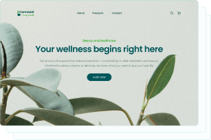
Captivate your audience and enhance brand perception with our custom website design services, creating an unforgettable digital experience.

Captivate your audience and enhance brand perception with our custom website design services, creating an unforgettable digital experience.


